Unlocking the Power of Phi: The Golden Ratio in Design and Nature
Discover the golden ratio, Phi, and how this mysterious proportion appears in nature, architecture, art, branding, beauty, and modern design.
Some numbers feel cold. They belong to spreadsheets, equations, calculators, bank statements, measurements, and school notebooks. They are useful, but not romantic. They explain the world without making it feel alive.
Then there is Phi.
The golden ratio, often written as φ or Phi, is one of the rare mathematical ideas that feels almost poetic. It sits at the strange intersection of science, beauty, design, art, architecture, nature, and human perception. It is a number, yes — approximately 1.618 — but over centuries, it has become much more than that. It has been called the divine proportion, the golden mean, the golden section, and one of the most elegant patterns hidden in the fabric of the world.
From spiraling shells to sunflower seeds, from classical architecture to modern logos, from Renaissance paintings to smartphone layouts, the golden ratio has fascinated mathematicians, artists, designers, architects, philosophers, and dreamers. It suggests that beauty may not be purely random. It hints that harmony can sometimes be measured. It whispers that nature and design may share a secret language.
But the golden ratio is also widely misunderstood. It is sometimes exaggerated, romanticized, or forced into places where it may not truly exist. Not every beautiful face follows Phi. Not every famous artwork was secretly built on golden rectangles. Not every spiral in nature is a perfect golden spiral. The real story is more interesting than the myth.
The power of Phi is not that it magically explains all beauty.
The power of Phi is that it reveals how proportion shapes the way we see, feel, build, and recognize harmony.
What Is the Golden Ratio?
The golden ratio is a special mathematical relationship between two quantities. Imagine a line divided into two parts: a longer part and a shorter part. The division is golden when the ratio of the whole line to the longer part is the same as the ratio of the longer part to the shorter part.
In simple terms, the larger section relates to the smaller section in the same way the whole relates to the larger section.
That relationship produces the number:
1.6180339887…
This number continues infinitely without repeating, like pi. It is usually shortened to 1.618 and represented by the Greek letter φ, pronounced “phi.”
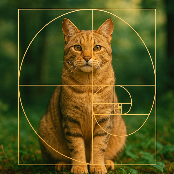
A simple way to imagine it is this: if you have a rectangle whose sides follow the golden ratio, the longer side is about 1.618 times the shorter side. This creates what is known as a golden rectangle.
The golden rectangle has fascinated designers because it feels balanced without being boring. It is not a square, which can feel static. It is not too long or stretched, which can feel unstable. It has a natural sense of proportion that many people find pleasing.
That is the heart of Phi: a relationship that feels harmonious.
Why Phi Feels So Beautiful
Beauty is complicated. It is shaped by biology, culture, memory, emotion, fashion, symmetry, contrast, color, movement, and personal experience. No single number can explain all of it.
Still, proportion matters deeply.
A room can feel calming or awkward depending on its proportions. A logo can feel strong or clumsy depending on spacing. A face can feel balanced because of relationships between features. A website can feel professional because the layout has visual rhythm. A painting can guide the eye because its composition respects hidden structure.
The golden ratio appeals to designers because it offers a way to create balance with movement. Unlike perfect symmetry, which can sometimes feel rigid, Phi creates asymmetrical harmony. It allows one part to dominate while still feeling connected to the whole.
This is why the golden ratio is so useful in visual design. It can help determine:
The size relationship between text and images.
The spacing between design elements.
The proportions of a logo.
The dimensions of a layout.
The structure of a photograph.
The relationship between a main focal point and surrounding space.
Phi does not guarantee beauty, but it can help create visual order. It gives the eye a path. It makes design feel intentional.
The Golden Ratio and the Fibonacci Sequence
The golden ratio is closely connected to the Fibonacci sequence, one of the most famous number patterns in mathematics.
The Fibonacci sequence begins like this:
0, 1, 1, 2, 3, 5, 8, 13, 21, 34, 55, 89, 144…
Each number is created by adding the two numbers before it. For example, 2 + 3 = 5, 5 + 8 = 13, and 13 + 21 = 34.
The magic appears when you divide one Fibonacci number by the number before it. As the numbers get larger, the ratio gets closer and closer to Phi.
For example:
34 ÷ 21 = 1.619
55 ÷ 34 = 1.617
89 ÷ 55 = 1.618
144 ÷ 89 = 1.617
The bigger the numbers get, the closer they move toward the golden ratio.
This connection between Fibonacci numbers and Phi is one reason the golden ratio appears in discussions of natural growth. Many plants grow in patterns related to Fibonacci numbers because those arrangements can help optimize space, light exposure, and packing efficiency.
This is where mathematics begins to look alive.
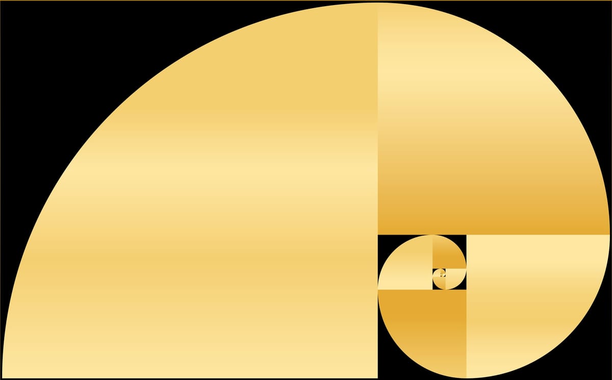
The Golden Spiral: Nature’s Most Famous Curve
When people think of the golden ratio in nature, they often imagine the golden spiral. This spiral is created by drawing quarter-circle arcs inside a series of golden rectangles or Fibonacci-sized squares. The result is a smooth expanding curve that grows wider by the golden ratio.
The golden spiral has become a visual symbol of natural beauty. It is often associated with seashells, galaxies, hurricanes, flowers, and even animal horns.
But here is where we need to be careful.
Not every spiral in nature is a perfect golden spiral. Many natural spirals are logarithmic spirals, meaning they expand in a consistent mathematical way, but not always exactly according to Phi. Some shells and plants approximate golden-ratio-related patterns. Others do not.
The golden spiral is still valuable because it gives us a way to understand growth, expansion, and visual movement. It shows how a form can grow larger while keeping its overall shape. That is one reason spirals feel so natural to the human eye. They suggest motion, energy, and life.
A spiral is not frozen beauty.
It is beauty unfolding.
Phi in Nature: Where the Golden Ratio Appears
Nature is full of patterns. Some are chaotic, some are symmetrical, and some are mathematical in ways that seem almost impossible at first glance. The golden ratio and Fibonacci-related patterns appear most famously in plants, seed arrangements, petals, pinecones, and certain growth structures.
Sunflowers
Sunflowers are one of the classic examples. Their seeds often form spirals moving in opposite directions. The number of spirals in each direction frequently corresponds to Fibonacci numbers, such as 34 and 55, or 55 and 89. This arrangement allows seeds to pack efficiently into the flower head.
This is not nature trying to be artistic in the human sense. It is nature solving a packing problem beautifully.
Pinecones
Pinecones also often show spiral patterns that correspond to Fibonacci numbers. If you look closely, you may see spirals running clockwise and counterclockwise. The counts often match neighboring Fibonacci numbers.
Again, the purpose is not decoration. It is efficient growth.
Flower Petals
Many flowers have petal counts that fall within Fibonacci numbers: 3, 5, 8, 13, 21, and so on. Not all flowers follow this pattern, but enough do to make the relationship fascinating.
Leaves and Branches
Plants often arrange leaves around stems in ways that reduce overlap and maximize sunlight exposure. This field is called phyllotaxis. Some phyllotactic patterns are related to Fibonacci ratios and golden-angle spacing.
The golden angle, about 137.5 degrees, is connected to the golden ratio. It helps distribute leaves, seeds, or petals efficiently around a center point.
Shells
Some shells display logarithmic spirals that resemble the golden spiral. The nautilus shell is often cited as a golden ratio example, though this is frequently overstated. Nautilus shells are beautiful, but they do not perfectly match the golden spiral. Still, they demonstrate a related idea: growth that preserves shape.
Animal Bodies
Some people claim the golden ratio appears in animal bodies, human faces, and bone structures. There may be proportional relationships in biology that approximate Phi, but many popular claims are exaggerated. Beauty in living bodies is complex and cannot be reduced to a single formula.
The more honest conclusion is this: nature often uses efficient mathematical patterns, and some of those patterns connect to Fibonacci numbers and Phi. The golden ratio is not everywhere, but where it does appear, it reveals something powerful about growth and structure.
The Golden Ratio in Human Beauty
Few topics are more controversial than the golden ratio and human beauty.
For decades, beauty analysis has often linked facial attractiveness to symmetry, proportion, and certain mathematical relationships. Some researchers, designers, surgeons, and artists have used Phi-based measurements to discuss facial balance. Popular culture has turned this into claims that the “perfect face” follows the golden ratio.
But human beauty is not that simple.
A face can be beautiful without matching Phi. A face can match certain proportions and still feel uninteresting. Attraction depends on expression, charisma, skin, voice, movement, confidence, culture, personality, uniqueness, and emotion. The most memorable faces are often not mathematically perfect. They are alive.
Still, proportion matters. The distance between facial features, the balance of forehead, nose, lips, chin, cheekbones, and jawline can affect how harmonious a face appears. This is why artists and photographers study facial geometry. It helps them understand balance.
The golden ratio can be one tool for studying facial aesthetics, but it should never become a prison. Beauty is richer than a number.
The sexiest faces are not always perfect.
They are unforgettable.
The Golden Ratio in Art
Artists have long been fascinated by proportion. Even before the golden ratio became a popular cultural concept, painters, sculptors, and architects studied balance, geometry, symmetry, and composition.
The golden ratio is often associated with famous works of art, including pieces by Leonardo da Vinci, Michelangelo, Botticelli, and Salvador Dalí. Some of these associations are historically debated. In some cases, artists intentionally used mathematical proportion. In others, later viewers may have projected Phi onto works that were not consciously designed that way.
Still, the golden ratio remains useful in art because it helps organize visual attention.
A canvas divided according to golden proportions can create a pleasing relationship between subject and background. A figure placed near a golden-ratio point can feel naturally balanced. A composition built around golden rectangles can create movement and depth.
Artists do not need Phi to create beauty. But when used thoughtfully, it can help guide the viewer’s eye.
It creates structure without making the structure obvious.
That is the secret of great composition. The viewer should feel the harmony before noticing the math.
The Golden Ratio in Architecture
Architecture is one of the fields most closely associated with the golden ratio. Buildings depend on proportion. A doorway can feel grand or awkward. A column can feel elegant or heavy. A facade can feel balanced or chaotic. The relationship between height, width, spacing, and repetition determines emotional impact.
The golden ratio has been linked to ancient Greek architecture, especially the Parthenon, though historians debate how intentionally it was used. Whether or not every famous claim is accurate, the broader idea remains true: classical architecture valued proportion deeply.
In architecture, Phi can help create:
Balanced facades.
Harmonious room dimensions.
Elegant window spacing.
Human-scaled interiors.
Pleasing relationships between structural parts.
Modern architects may not always use the golden ratio directly, but proportional systems remain central to design. A building that ignores proportion can feel uncomfortable even if people cannot explain why.
Architecture teaches us that beauty is not only decoration.
Beauty is measurement made emotional.
The Golden Ratio in Graphic Design
In graphic design, the golden ratio is a practical tool. Designers use it to create layouts that feel balanced, professional, and visually pleasing.
A magazine spread might use golden proportions to determine image size and text columns. A poster might place the main subject along a golden-ratio grid. A logo might use circles or rectangles based on Phi to create internal harmony. A website might use golden-ratio spacing for content blocks, sidebars, and typography.
The golden ratio helps designers answer questions like:
How large should the headline be compared with the body text?
Where should the image sit?
How much white space should surround the subject?
How wide should the content column be?
What proportions make the design feel premium?
This is why Phi remains relevant in branding and digital design. It offers a subtle system for visual decision-making.
Good design is rarely accidental. Even when it looks simple, it is often built on hidden relationships.
The Golden Ratio in Logo Design
Logo design is one of the most popular modern uses of the golden ratio. Designers sometimes use golden circles, golden rectangles, and Phi-based grids to create logos that feel balanced and memorable.
The idea is not to force every logo into a golden-ratio diagram. That can become gimmicky. The best logo design uses proportion as support, not decoration.
A strong logo needs clarity, scalability, originality, memorability, and brand meaning. The golden ratio can help refine shapes and spacing, but it cannot replace concept.
Still, when used well, Phi can make a logo feel smoother and more natural. It can improve curves, alignments, spacing, and relationships between elements.
The golden ratio is like perfume in design.
Used lightly, it enhances everything.
Used too heavily, it becomes distracting.
The Golden Ratio in Web Design and UI
Modern digital design is full of proportion problems. A website or app must guide attention, organize information, and feel comfortable across different screens.
The golden ratio can help with:
Hero section layouts.
Image-to-text balance.
Sidebar width.
Card dimensions.
Button spacing.
Typography scale.
Content hierarchy.
For example, a designer might set a content area and sidebar using a 1.618 relationship. Or they might use a golden-ratio-based type scale, where each heading size increases proportionally.
This can create a natural visual rhythm. The page feels easier to scan. The hierarchy feels clearer. The design feels more elegant.
However, responsive design requires flexibility. A strict golden-ratio layout may not work perfectly on all devices. Designers must adapt Phi to real-world usability.
The golden ratio should serve the user, not dominate the interface.
The Golden Ratio in Photography
Photographers often use composition rules to create stronger images. The most famous is the rule of thirds, where the frame is divided into three equal parts horizontally and vertically. The golden ratio offers a more refined alternative: the golden grid or golden spiral.
Instead of placing the subject exactly one-third into the frame, a photographer may place it along golden-ratio lines or near golden-ratio intersection points. This can create a more natural flow.
The golden spiral can also guide composition by leading the viewer’s eye through the image. A portrait might place the face near the spiral’s center. A landscape might follow the curve from foreground to background. A fashion photo might use the body’s pose to echo spiral movement.
The result can feel dynamic yet balanced.
Photography is about light, emotion, timing, and composition. Phi cannot replace instinct, but it can sharpen it.
The Golden Ratio in Fashion and Beauty
Fashion may not always mention mathematics, but it lives by proportion. A cropped jacket changes the apparent length of the legs. A high waist changes the body line. A neckline affects the face. A heel changes posture. A belt divides the torso. A hairstyle changes facial balance.
The golden ratio can help explain why some silhouettes feel elegant. A dress may look beautiful because the waistline divides the body in a pleasing proportion. A handbag may feel luxurious because its shape follows balanced dimensions. A magazine cover may feel glamorous because the face, typography, and negative space are arranged harmoniously.
In beauty, makeup artists also use proportion intuitively. Eyebrow shape, lip balance, contour placement, blush height, and eyeliner length all affect visual harmony.
But again, Phi should not become a rigid beauty rule. The most magnetic beauty often comes from breaking proportion with confidence. A dramatic eye, an oversized coat, a sharp bob, a bold lip, or unusual styling can be powerful precisely because it disrupts expectation.
Fashion uses proportion, but style uses personality.
Phi and the Psychology of Visual Pleasure
Why do humans respond to proportion?
One explanation is that the brain enjoys patterns that are neither too simple nor too chaotic. Perfect symmetry can feel stable but sometimes dull. Randomness can feel exciting but sometimes stressful. The golden ratio sits between order and movement.
It creates variety inside structure.
This may be why Phi-based designs often feel calm but not lifeless. They have direction. The eye moves naturally from one part to another. The relationship between elements feels satisfying.
Visual pleasure often comes from the brain recognizing structure without needing to consciously analyze it. You may not know why a design feels elegant, but your eye senses balance.
This is where Phi becomes powerful for creators. It helps create beauty that feels instinctive.
The audience does not need to see the formula.
They only need to feel the harmony.
The Mythology of the Divine Proportion
The golden ratio has gathered mythology around itself for centuries. Some writers have treated it almost like a mystical key to the universe. It has been connected to divine beauty, sacred geometry, spiritual symbolism, and cosmic order.
This mythic reputation is understandable. Phi appears in mathematics, geometry, plant growth, design systems, and aesthetic theory. It feels mysterious because it connects abstract number with visible form.
But myth can become exaggeration.
Many viral claims about the golden ratio are overstated. Some diagrams placed over famous paintings, celebrity faces, buildings, and logos are created after the fact. They may look convincing, but that does not prove intentional use. Human beings are excellent at finding patterns, even where patterns are loose or coincidental.
The smarter way to appreciate Phi is to hold both truths:
The golden ratio is genuinely mathematically beautiful and practically useful.
The golden ratio does not explain all beauty and should not be treated as magic.
That balanced view makes Phi more powerful, not less.
Real wonder does not require exaggeration.
How Designers Can Use the Golden Ratio Practically
For designers, the golden ratio is most useful when applied as a flexible guide.
Start with layout. If you are designing a page, divide the width by 1.618 to create a main content area and secondary area. This can help balance text and images.
Use it in typography. If your body text is 16px, multiplying by 1.618 gives about 26px, which may work for a subheading. Multiplying again gives about 42px, which may work for a larger heading. Adjust based on readability.
Apply it to spacing. Margins, padding, and gaps can follow proportional relationships to create rhythm.
Use it in image cropping. Place key subjects near golden-ratio points for a more refined composition.
Use it in logo refinement. Golden circles or rectangles can help smooth curves and align shapes.
But do not force it. If the design feels better slightly adjusted, trust the design. Phi is a guide, not a law.
The best designers use mathematics and intuition together.
Phi in Product Design
Product design also depends on proportion. A phone, watch, chair, bottle, car, perfume flacon, or furniture piece must feel good visually and physically. The golden ratio can help shape products that feel balanced in the hand, pleasing to the eye, and premium in appearance.
Many luxury products use subtle proportional systems. A perfume bottle may feel elegant because the cap, neck, label, and body relate beautifully. A chair may feel balanced because the legs, seat, and backrest have harmonious dimensions. A smartphone interface may feel intuitive because spacing and hierarchy respect visual rhythm.
Product beauty is never only surface. It is the relationship between usability and desire.
The golden ratio can help turn function into seduction.
The Golden Ratio and Branding
Brands want to be remembered. They want to feel trustworthy, elegant, energetic, luxurious, playful, or powerful. Visual proportion helps create these feelings.
A luxury brand may use golden-ratio spacing to create calm and exclusivity. A technology brand may use proportional grids to signal precision. A beauty brand may use Phi-inspired curves to create softness and femininity. A wellness brand may use golden-ratio layouts to feel natural and balanced.
Branding is emotional architecture. Every visual choice tells the audience how to feel.
The golden ratio gives brands a hidden grammar of harmony.
Why Nature Loves Efficient Patterns
When we see Fibonacci patterns in nature, it can feel like nature is trying to be beautiful. But nature is usually trying to survive.
Efficient seed packing helps plants reproduce. Leaf arrangements that reduce overlap help photosynthesis. Spiral growth can allow expansion without changing overall form. Shell growth follows mathematical rules because organisms add material in consistent ways.
Beauty emerges because efficiency often creates elegance.
That may be the most profound lesson of Phi in nature. Beauty is not always separate from function. Sometimes beauty is what function looks like when it has been refined by time.
A sunflower is beautiful because it is alive.
It is mathematical because it is efficient.
It is astonishing because both are true.
The Golden Ratio in Music and Rhythm
Although the golden ratio is most famous in visual design, people have also explored its relationship to music. Some composers and theorists have examined whether musical climaxes, phrase lengths, or structural divisions sometimes align with golden proportions.
Not every claim is convincing, and music should not be reduced to arithmetic. But proportion clearly matters in music. A song or symphony depends on timing, repetition, variation, tension, release, and structure. A climax placed too early may feel rushed. Too late, and the listener may lose interest. Balanced timing can create emotional satisfaction.
Whether or not Phi is intentionally used, the broader principle applies: beauty often depends on proportion through time.
In visual art, proportion exists in space.
In music, proportion exists in duration.
The Golden Ratio in Storytelling
Even storytelling can be understood through proportion. A novel, film, or article needs structure. The opening must invite. The middle must expand. The climax must arrive with enough buildup. The ending must satisfy.
Some writers think in three acts. Some use hero’s journey structures. Some use rising action and resolution. These are not golden-ratio systems exactly, but they share a similar idea: emotional balance depends on proportional relationships.
A story that spends too long setting up may feel slow. A story that resolves too quickly may feel shallow. A story with carefully balanced sections feels more natural.
This is why Phi can inspire creators beyond design. It reminds us that beauty is not only in objects. It is in pacing, rhythm, contrast, and timing.
Criticism: Does the Golden Ratio Really Matter?
Skeptics argue that the golden ratio is overused in design discussions. They point out that many famous examples are exaggerated, that people find beauty in many proportions, and that cultural taste changes over time.
They are right to be cautious.
The golden ratio is not a universal beauty button. You cannot apply it blindly and expect instant elegance. A bad design built on Phi is still a bad design. A boring logo inside a golden rectangle is still boring. A poorly composed photograph does not become art because a spiral overlay fits somewhere.
But dismissing Phi completely is also too simplistic.
The golden ratio remains useful because it teaches designers to think proportionally. It encourages relationships between parts. It gives structure. It trains the eye. Even when the final result does not follow Phi exactly, the process can improve visual decision-making.
The golden ratio matters most not as a superstition, but as a discipline.
How to See Phi in Everyday Life
Once you understand the golden ratio, you may begin noticing proportion everywhere.
In the shape of leaves.
In the curve of a staircase.
In the layout of a magazine.
In the spacing of a luxury website.
In the composition of a movie frame.
In the balance of a room.
In the silhouette of a dress.
In the curve of a logo.
In the way a photographer places a face slightly off-center.
Not all of these are intentional golden-ratio examples, but noticing them changes the way you see. You begin to understand that beauty often has structure. You begin to feel when proportions are calm, tense, elegant, or awkward.
This is the real gift of studying Phi.
It makes the eye more intelligent.
Why the Golden Ratio Still Fascinates Us
The golden ratio continues to fascinate us because it offers a bridge between two worlds: logic and wonder.
On one side, Phi is mathematics. It can be defined, calculated, constructed, and studied. On the other side, it appears connected to beauty, growth, movement, and design. It lets us feel that the universe is not only measurable, but meaningful.
That is why artists love it. That is why architects study it. That is why designers use it. That is why nature writers return to it. That is why people still search for it in faces, flowers, buildings, paintings, shells, logos, and galaxies.
Phi gives us the thrill of discovering order inside beauty.
And beauty inside order.
Final Verdict: Phi Is Not Magic—It Is Harmony Made Visible
The golden ratio is not a mystical shortcut to perfection. It does not explain every beautiful face, every masterpiece, every flower, or every great design. Many popular claims about Phi are exaggerated, and the real world is far messier than a perfect spiral overlay.
But that does not make Phi less remarkable.
The golden ratio remains one of the most elegant relationships in mathematics, and its influence on design, nature, art, architecture, branding, photography, and visual culture is undeniable. It teaches us that proportion matters. It shows us how growth can create pattern. It gives creators a tool for harmony. It gives viewers a way to understand why some things feel balanced, natural, and alive.
Phi is powerful because it reminds us that beauty is not always random.
Sometimes it has rhythm.
Sometimes it has structure.
Sometimes it has a number quietly glowing beneath the surface.
The golden ratio is not the whole story of beauty.
But it is one of its most beautiful chapters.
FAQ: The Golden Ratio in Design and Nature
What is the golden ratio?
The golden ratio is a mathematical proportion represented by the Greek letter Phi, or φ. It is approximately 1.618 and occurs when the ratio of a whole to its larger part equals the ratio of the larger part to the smaller part.
Why is the golden ratio called Phi?
The golden ratio is represented by the Greek letter Phi, often written as φ. The symbol became commonly associated with the ratio because of its mathematical and historical significance.
What is the golden rectangle?
A golden rectangle is a rectangle whose side lengths follow the golden ratio. The longer side is approximately 1.618 times the shorter side. Many designers find this proportion visually pleasing.
How is the golden ratio connected to the Fibonacci sequence?
As Fibonacci numbers increase, the ratio between consecutive numbers gets closer to the golden ratio. For example, 89 divided by 55 is approximately 1.618.
Does the golden ratio appear in nature?
Yes, golden-ratio-related patterns and Fibonacci numbers appear in some natural structures, especially in plant growth, seed arrangements, pinecones, and flower patterns. However, not every natural spiral or beautiful form follows the golden ratio exactly.
Is the nautilus shell a perfect golden spiral?
No. The nautilus shell is often used as a golden ratio example, but this is usually overstated. It has a beautiful logarithmic spiral, but it does not perfectly match the golden spiral.
Why do designers use the golden ratio?
Designers use the golden ratio to create balanced layouts, harmonious spacing, pleasing proportions, and visual hierarchy. It can help guide composition in graphic design, web design, logo design, photography, and architecture.
Does the golden ratio define human beauty?
No. Human beauty is too complex to be defined by one number. The golden ratio can be used to study proportion, but attractiveness also depends on expression, personality, culture, symmetry, uniqueness, and emotional presence.
Is the golden ratio used in architecture?
Yes, the golden ratio has influenced architectural thinking and proportional design. Some historical claims are debated, but proportion has always been central to architecture, and Phi remains a useful design reference.
Is the golden ratio really important or just a myth?
It is both meaningful and often mythologized. The golden ratio is mathematically real and useful in design, but many popular claims about its presence in famous artworks, faces, and buildings are exaggerated. Its true value lies in understanding proportion and harmony.